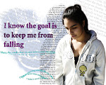
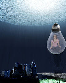
My favorite was the vampire picture. I really liked this picture because it looks so creative and I was able to make an ordinary picture into a vampire with just using Photoshop. The new tools that I learned would be that how i can be able and blend other pictures together. How I can make a picture come out looking like a shaderd glass. My difficulties or the difficulties that I ran into would be painting and making it look like a vampire. I would be able to use photoshop in a place where you can make invitations or for fixing pictures of models.
Tuesday, October 27, 2009
Thursday, October 15, 2009
Critique: Robert & Shana ParkeHarrison

There is this man in the middle of a lake with a hammer in his hand and some wood on his back. He has a black suit on and he is a little bald. This man is on his knees and it looks like he is about to fall or sink into the water. This man has made ripples around him and the wooden walk way to the lake. There are some very nice and calm colors in the background. The calm grey background makes us be able to see the water and the man in the water.
It looks like he is building some sort of walk way toward the water or lake. It also looks like he wants to get to the middle of the lake. The wooden walkway is the leading line that takes us to this man what also takes us to this man is the ripples that are all around him. That’s what is making us look at this man because there is really nothing around him and he is the center or everything.
This picture portrays that it is empty although at the same time it shows us some calm feeling. It shows us that a place like this would be nice to go.
It looks like he is building some sort of walk way toward the water or lake. It also looks like he wants to get to the middle of the lake. The wooden walkway is the leading line that takes us to this man what also takes us to this man is the ripples that are all around him. That’s what is making us look at this man because there is really nothing around him and he is the center or everything.
This picture portrays that it is empty although at the same time it shows us some calm feeling. It shows us that a place like this would be nice to go.
Thursday, October 1, 2009
Photographic Effects


My Favorite was the Adjustment layers this is becuase it was very fun and you can change and make your pictures darker of lighter. I would like to work more on adjustment layers it just has so many cool and interesting things you can find on it. I discovered that it is a little fun and easy to change pictures just to make them nicer and it is also exciting.
Monday, September 21, 2009
Portraits


The portrait that I was most successful with would probably be the Costume/Prop. I think that it is the Costume/Prop because the compositional trick you can really tell and it just looks so nice. For the artisitic portrait I tried to portray hapiness. I also captured some hapiness and that the person is having fun. The prop or costume that we used was his footbal jersey this is because he plays in the football team. Yes i really like the way the picture turned out because it is nice and you can see the compositional trick leading lines and you can see the champions sign. I think that the unigue picture is so unique and different becuase who would see that a person would take a picture of someone upside down from a rail. It was such a frustration for me to get a good picture for simplicity with face becuase sometimes its hard to get a simple background. Although it was fun and it made us think and find something interesting.
Friday, September 11, 2009
Contact Sheet
The picture that I like the most is the one titled with "Rule of Thirds". This is because it is the best looking one for me and it was also becuase it was the first one I took since the beginging of the year. The trick that I may be using day to day photographs would probably be macro. This is becuase, we would be able to see the nice textures of things that you couldn't even imagine. The least favorite of the photographs would be Simplicity. This is because it was hard for me to find a simple background but an interesting emphasis. The photo that was the favorite or that I really liked was the Rule of Thirds this is becuase his expression really made it look fantastic.
Friday, September 4, 2009
Compostitional Trick #8 Fill in Flash

Fill in flash really affected my photos although they really didn't affect them that much. Though you could see the difference between where you can see the background and where you can see the background and the emphasis. You use fill in flash whenever you take the picture and you cannot see the emphasis or you cannot see the bakcground. You use it in order to see both the background and your emphasis.
Compositional Trick #7 Drawing With Light
This compositional trick really sets all of the other photos apart because with this you can see the light that you can get in a very hot and sunny place. The feeling that this picture really gives me is that his shirt is so bright that you can see it shine and with his shirt shining you can be able to see his face clearly. It makes me feel that it is a really nice place to have sun and have some shade at the same time.Compositional Trick #6 Framing

What framing really does is that it makes you see what is your emphasis and it makes you concentrate on it the most. The frame in my photos is okay although the first one isn't very good looking because I could have made him be more in the center. Although the photo right above is okay although I could have looked for it to be a little darker place.Compositional Trick #5 Extreme Angles


Extreme Angles is a very good compositional trick to know because you can make other people see things in a different kind of way. This is because something that is small or short you make them see it from the bottom from an angle that you have never seen them before. I really don't think that my extreme angles pictures are very good this is because I could of made them look more dramatic then what they look like now.
Compositional Trick #4 Simplicity

What Simplicity really means is that it has a simple background that makes the emphasis be more visible. Although I didn't do a very good job in these two simplicity shots. Though the things is that simplicity does not mean that the picture is boring its that the background is just calm and not a lot of things are happening behind your emphasis. Simplicity is a very good trick because it makes your emphasis more interesting. You would use it to make them look a little betterThursday, August 27, 2009
Compostitional Trick #3 Macro


What Macro really does is that it makes you take a different kind of view of things that are not even important to you. It makes you see the different kinds of textures that you cann't see somewhere else or that you are not able to see. It is good to use this because you are able to see the different kinds of bugs and spiders and things like that.
Tuesday, August 25, 2009
Compositional Trick #2 Leading Lines

The thing about Leading Lines is that it is like when you see a sidewalk or lines and they take you to something interesting and you just stop and stare at it. What Leading lines do is that they make you just keep or go to the person or thing (emphasis) and it just catches your attention. You would use Leading Lines in order for another person to see what it would take you to it and it will just keep you looking at that for the whole time.
Compositional Trick #1 Rule of Thirds

The Rule of Thirds is a great way so that you are able to put your subject out of the center. It makes it look better than before so that your picture looks a bite better and not just a photograph or a pose picture. It is good to use the Rule of Thirds whenever you want people to see the beauty so that you are also able to see this person and see the emphasis or person.
Subscribe to:
Posts (Atom)